Your style is everything
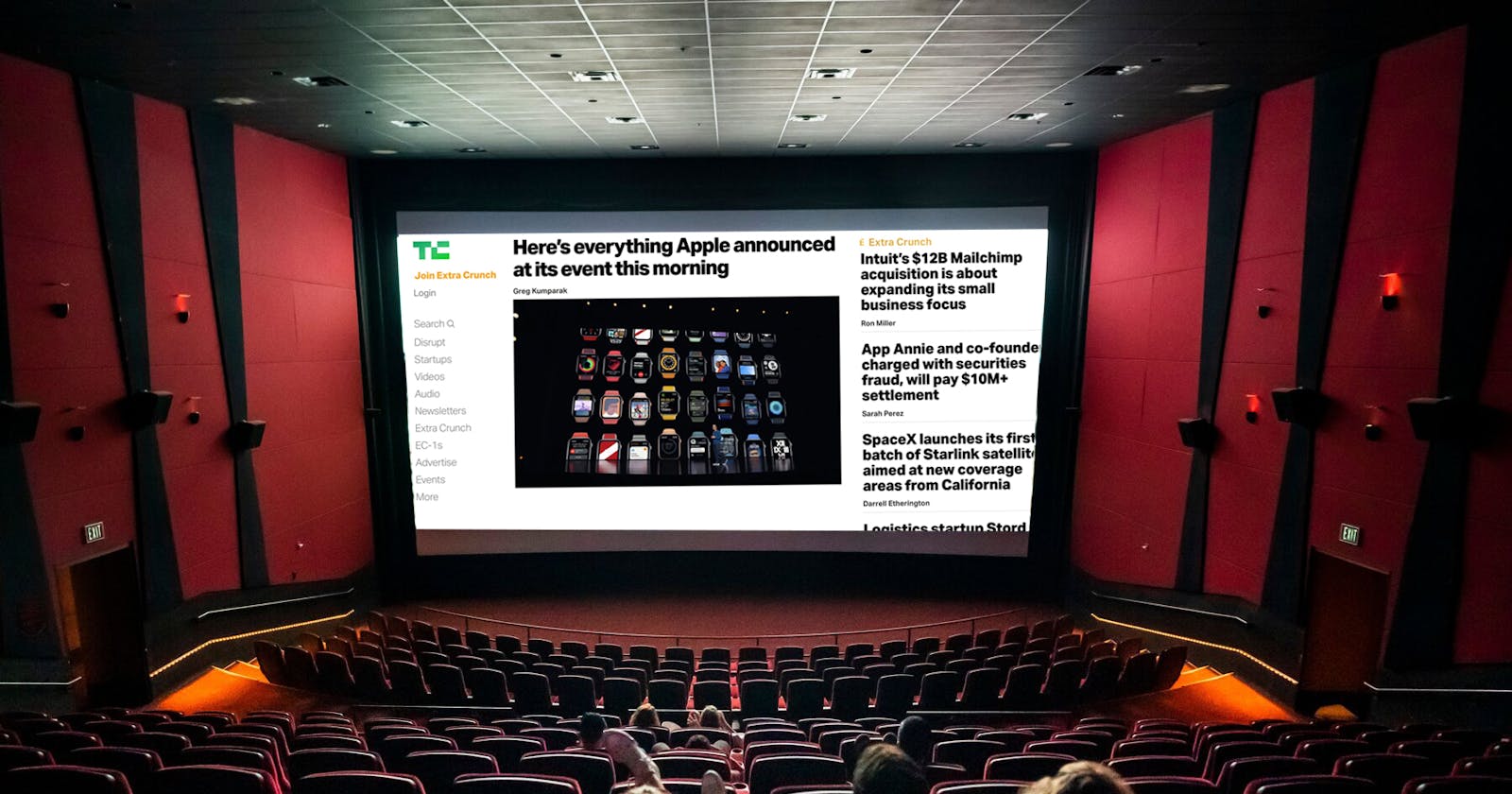
When you're on a first date, and you get that age-old question "What's your favorite movie?", you probably have one or two answers up your sleeve, right? Well, what if someone asked you what your favorite website is? It really is not as strange as it sounds. Some people browse Instagram more than they post on Facebook. Other people may have their homepage be TechCrunch while others enjoy just the Google search bar for quick access.
To set your website up for success, however, you do not need a design degree to make a website look great. With the power of CSS and some basic design ideas, you are on your way to making an amazingly memorable website.
Color
Let's talk palettes, my darling. A palette that is uniform and helps broadcast what you are selling is KEY. Take a look at my profile photo as an example.
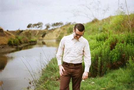

Absolutely stunning. This photo has a really nice nature-based color palette, different greens and yellows that mix very well together. There are dozens of color palette picking websites out there that can help you choose what colors go well with each other. The Adobe Color Wheel is one of my favorites.
Symmetry
The human mind craves symmetry. You see it all over the films and TV you watch. Whether you have noticed or not, the websites you make can feel really off when things do not line up the way you wanted them to. (align-text: center, much?)
Take a look at these screenshots. One is from The Royal Tenenbaums and the other is from the website of artist Max Shkret.
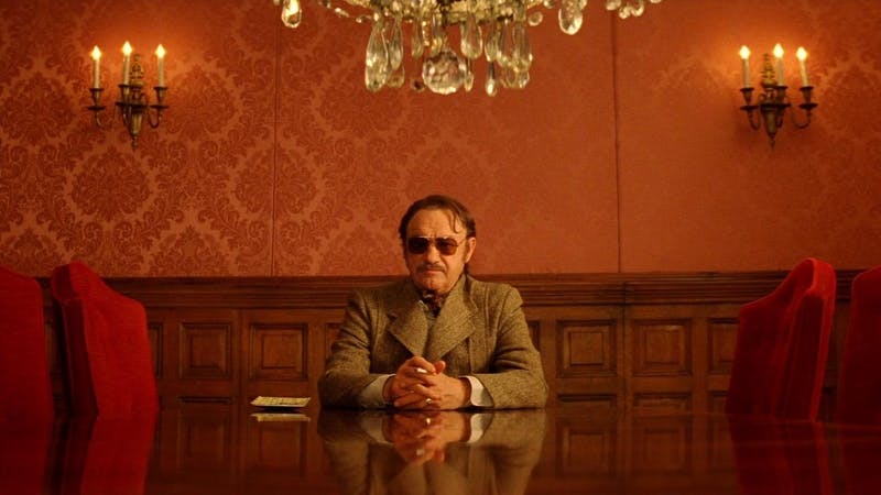
The Royal Tenenbaums, 2001
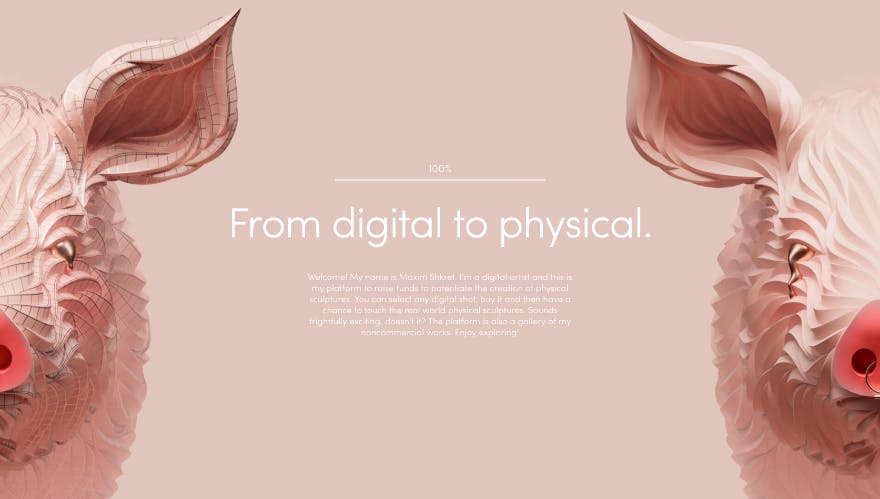
So well balanced. So eye-catching!
Presentation
Like any movie or TV show, you need the viewer to be there for the long haul. With very jarring imagery, the eyes begin to get very fatigued. (Hello, Transformers fight scenes, I am looking at you. But not for very long, because my eyes are bleeding.)
Imagine reading a great deal of text with a font that looks like this...

After a few sentences, your readers are going to be exhausted. Please, make the journey through your website tolerable. You definitely do not have to go with the sans-serif font provided by the browser, just pick something a little more pleasant, like this;

Wow, so much easier.
. . .
There are so many other tips and tricks to make your site more like a moving art piece. Whether you are keyframing, changing transparency, or incorporating video itself, where your website goes is up to you, and there isn't that much to learn to do it. A lot of times it's just a google search away to get an effect that will really make your work stand out. Thanks so much for reading. I will be posting a lot more about style, cinematic looks, and easy-to-understand design concepts for websites in future posts, so please follow, comment, and share.
